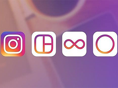
The redesign also extends towards the three applications owned by the social network: Boomerang (facilitates recording short videos), Layout (used to create photo collages) and Hyperlapse (creates fast motion videos).
As reported by the social network in its announcement, the new design improves how the App looks and feels, but without changing the navigation style that characterizes it. In addition, the App aims to put more focus on photos and videos.
Ian Spalter said that this redesign is a reflection of the different ways in which users of Instagram, Layoutt, Boomerang and Hyperlapse use the services. “We ask employees to describe Instagram logo of in less than 5 seconds. Almost all obviated the rainbow, lens and viewfinder”, said design specialist.
What is curious is that in the middle of the vintage revolution that society lives, Instagram has decided to eliminate the retro air that characterizes the App since its launch in 2009.
Several social networks impact
Instagram users level of satisfaction has always been high, since the platform is dynamic and filters have been improving. What happened, then, that the App become object of criticism?
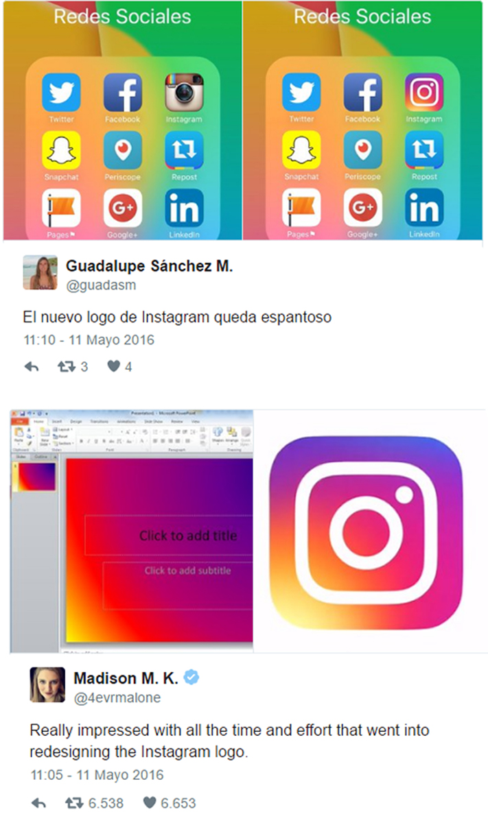
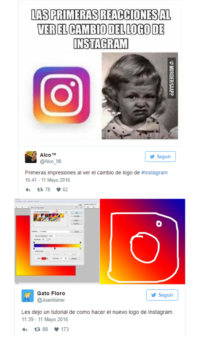
Social networks are sensitive, perhaps this is the reason why Instagram users does not applaud the new logo. Instead of this they express their rejection in other social networks like Twitter and Facebook.
Users in social networks, especially on Twitter, were quick to express their opinion:
What do you think about Instagram logo redesign?
Consult us about our Monthly Plan on Social Networks!


